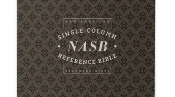
NASB Single Column Reference Bible (1995 Translation) Premier Collection: Goatskin, black. Grand Rapids: Zondervan. $200.00.
Zondervan Premier Collection
Regular readers of Things Above Us know we love books on theology, but you may not know we also sometimes review bibles, such as here and here. In this review, we will be taking a look at Zondervan’s new NASB Single Column Reference (SCR) Bible, which is part of their Premier Collection. As the name suggests, the Premier Collection features premium binding, paper, leather covers, and typesetting.
Presentation and Materials
First, I have to talk about the experience of first receiving this Bible. The Premier Collection SCR comes in a very nice black box, embossed with silver lettering on the top and sides and off-white, mocha lettering on the back. The Bible itself is elegantly wrapped in black paper with a silver seal holding it in place. The publishers also include a note which details the materials used and promising that the Bible comes with a lifetime guarantee.

The paper is an opaque 36 gsm with gold over red art gilding. The typesetting was designed by 2K/ Denmark exclusively for Zondervan and was printed in China. The binding is Smyth-sewn and I could not find any noticeable defects.
This edition of the Premier Collection SCR features a beautiful black goatskin cover and black leather liner. The grain pattern on the leather is completely natural and has a texture that I would describe as having an almost spongy feel to it. This is easily one of the softest Bibles I have ever held.
There are 5 raised ribs along the spine. The words “HOLY BIBLE” are stamped in gold between the second and third ribs from the top and “NEW AMERICAN STANDARD BIBLE” and “ZONDERVAN” in gold between the fourth and fifth ribs. The pages are art gilded in red under gold.

There are 2 black ribbons and 1 red ribbon included, with the red ribbon positioned towards the New Testament section. I found the ribbons to be an appropriate thickness for a Bible this size, not too thin and not too wide.
Layout

This Bible features the much-loved NASB 1995 translation. Zondervan has announced that they will continue printing the 1995 NASB, even after the NASB 2020 is released within the next year. The biblical text itself is printed in black, in a single column, verse by verse format. Poetic passages are offset and centered. Old Testament quotes which appear in the New Testament are printed in all caps, making them easy to recognize.
Page numbers, book names, chapter numbers,  and descriptive themes are printed in a bold, all caps, red font. Throughout this Bible the book name, chapter number, and page number are printed in red in the upper outer corner of each page, making it easy for the reader to quickly orient himself. References are printed along the outer edge of the page with the relevant verse number in red and Scripture citations in black, both in a smaller font than the Biblical text itself.
As already mentioned, Zondervan commissioned 2K/ DENMARK to come up with the typeface. To my eyes, the typeface has an almost modern look to it, so I was surprised to learn from a note at the back of the SCR Bible that it was inspired by Second Temple era inscriptions in Aramaic. A bible with too much clutter can be taxing, but the Premier Collection SCR’s combination of a generous 10.5 point font and Comfort Print typesetting make it incredibly easy to read.
Practical Use for Pulpit and Study
Providentially, shortly after this Bible arrived, I was invited to guest preach for a pastor friend who prefers the NASB. Having now had the chance to guest preach from this Bible, as well as reading it devotionally and for personal study, here are my thoughts on how it functions. While I was able to easily find my place when preaching from the SCR, it is not ideal for preaching and teaching. The layout is also not the type of minimalist style you would find in a reading Bible since, to be fair, it is produced and marketed as a reference bible.

This brings me to my only real critique, which is really more of an observation for anyone considering the Premier Collection SCR. A fair amount of the outer edge of the page is either left as empty space or filled with references, leaving the biblical text itself in the shape of a tall, narrow pamphlet. In other words, there is plenty of space for note-taking if desired, but the biblical text ends up being a little too tall and narrow for my tastes. I think widening the text another inch or two would have balanced out the functionality of this Bible.
Conclusion
Zondervan’s Premier Collection NASB Single Column Reference is a beautiful presentation of God’s Word in the renowned NASB 1995 translation. The materials and typesetting make this a Bible that can compete with similar, more expensive Bibles on the premium market. Those looking for a high-quality reference Bible should seriously consider this one.
A copy of this Bible was provided by the publisher in exchange for an honest review.


“Spongy” — that’s a perfect descriptor for these covers! I got their NRSVue bible recently. I guess some don’t like it, but I think it feels fantastic.